
Guide Page 引导页组件
该组件基于 uni-app x 开发的的 Guide Page 引导页组件,用于应用首次启动时的新手引导场景,支持全屏引导页、新功能引导、步骤引导,支持多页滑动展示、卡片动画、高度自定义样式,支持 App、H5、微信小程序全平台。
平台差异说明
仅支持 uni-app x 项目
| App | H5 | 微信小程序 |
|---|---|---|
| √ | √ | √ |
安装方式
只能通过 uni-app x 官方插件市场安装:立即去安装
推荐阅读
暂无推荐文章
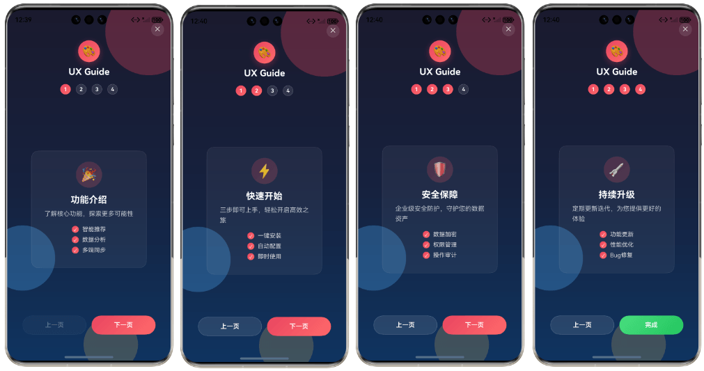
预览效果
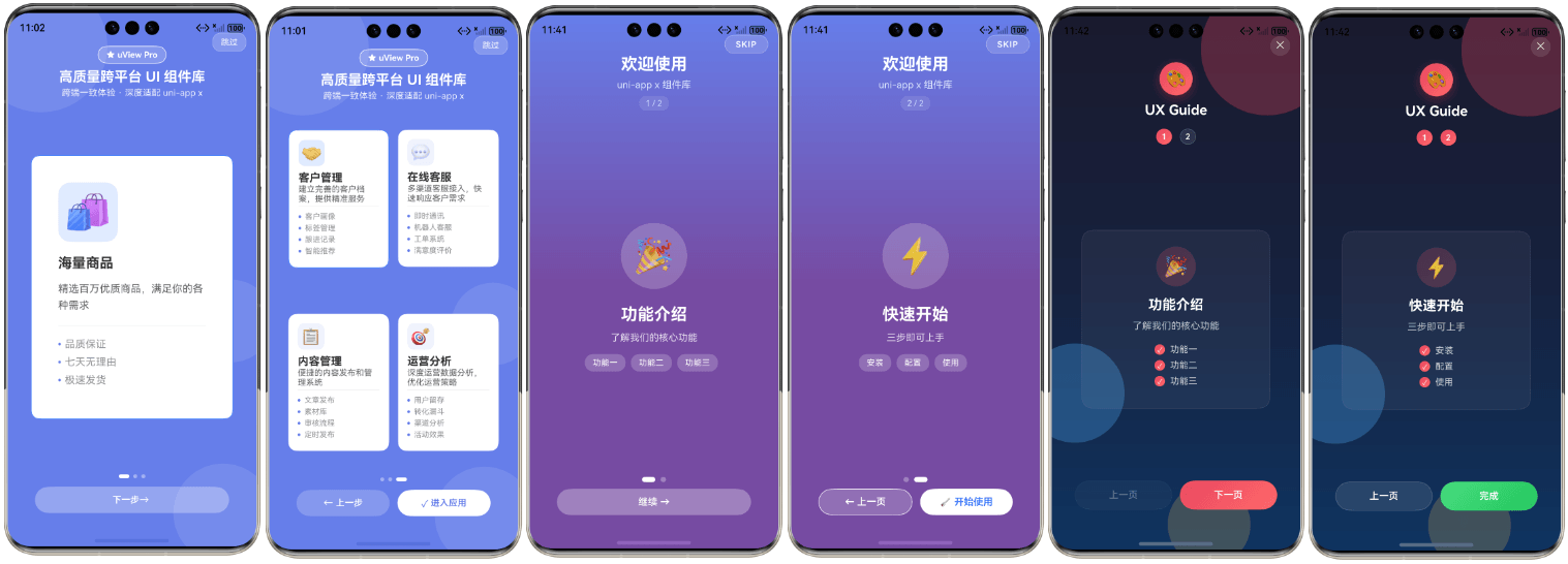
基本使用
首先,引导页需要全屏展示,所以 pages.json 中添加 "navigationStyle": "custom" 配置:
json
{
  "pages": [
    {
      "path": "pages/demo/index",
      "style": {
        "navigationBarTitleText": "uView Pro X 演示",
        "navigationStyle": "custom"
      }
    }
  ]
}- 通过
v-model:show控制引导页的显示与隐藏 - 通过
slides传入引导页数据,支持多页配置 - 通过
storage-key设置本地存储键名,自动记录用户是否已查看过引导页
html
<template>
    <ux-guide-page
        v-model:show="showGuide"
        :slides="slides"
        storage-key="app_guide_shown"
        @complete="onComplete"
    ></ux-guide-page>
</template>

<script setup lang="ts">
import { ref } from 'vue'
import type { OnboardingSlide } from '@/uni_modules/ux-guide-x/types'

const showGuide = ref(true)

const slides = ref<OnboardingSlide[]>([
    {
        cards: [
            {
                icon: '🚀',
                title: '快速上手',
                desc: '简单几步即可开始使用我们的应用',
                position: 'center',
                features: ['一键登录', '智能推荐', '个性定制']
            }
        ]
    },
    {
        cards: [
            {
                icon: '💡',
                title: '核心功能',
                desc: '探索应用的强大功能',
                position: 'center',
                features: ['实时同步', '数据分析', '云端存储']
            }
        ]
    }
])

function onComplete() {
    console.log('引导完成')
    // 跳转到首页
    uni.switchTab({ url: '/pages/index/index' })
}
</script>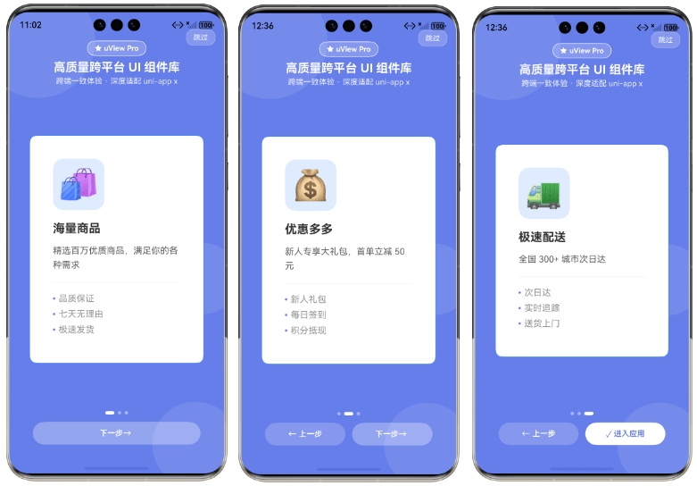
多卡片布局
每个页面支持配置多个卡片,卡片可以设置不同的位置(左上、右上、居中、左下、右下)。
html
<template>
    <ux-guide-page v-model:show="showGuide" :slides="multiCardSlides"></ux-guide-page>
</template>

<script setup lang="ts">
import { ref } from 'vue'
import type { OnboardingSlide } from '@/uni_modules/ux-guide-x/types'

const showGuide = ref(true)

const multiCardSlides = ref<OnboardingSlide[]>([
    {
        cards: [
            {
                icon: '📊',
                title: '数据分析',
                desc: '实时查看业务数据',
                position: 'top-left'
            },
            {
                icon: '🔔',
                title: '消息通知',
                desc: '及时获取重要信息',
                position: 'top-right'
            },
            {
                icon: '👤',
                title: '个人中心',
                desc: '管理个人信息',
                position: 'bottom-left'
            },
            {
                icon: '⚙️',
                title: '系统设置',
                desc: '自定义应用配置',
                position: 'bottom-right'
            }
        ]
    }
])
</script>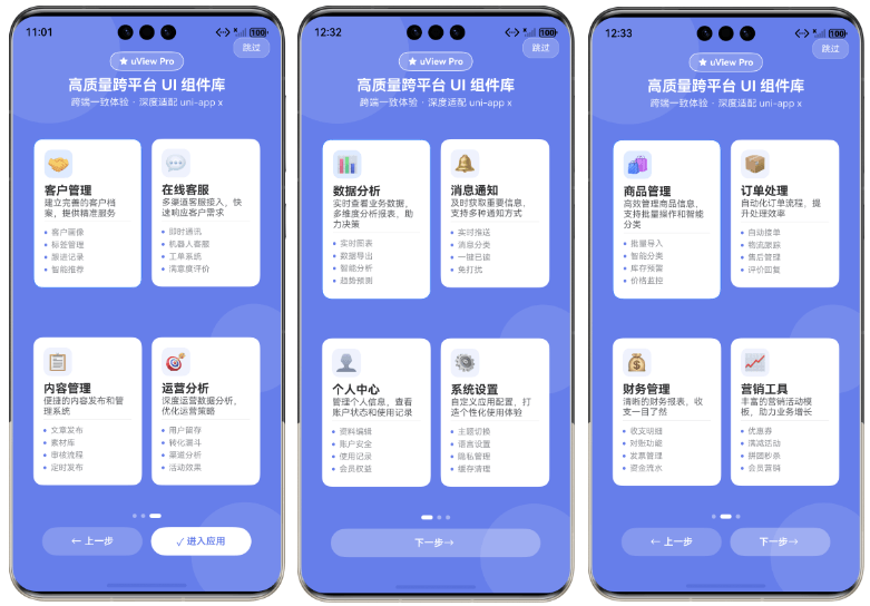
自定义卡片内容
可以单独自定义卡片的图标和内容部分:
html
<template>
    <ux-guide-page v-model:show="showGuide" :slides="slides">
        <!-- 自定义卡片图标 -->
        <template #card-icon="{ card, index, cIndex }">
            <view class="custom-icon">
                <image :src="card.icon" mode="aspectFit"></image>
            </view>
        </template>

        <!-- 自定义卡片内容 -->
        <template #card-content="{ card, index, cIndex }">
            <view class="custom-content">
                <text class="title">{{ card.title }}</text>
                <text class="desc">{{ card.desc }}</text>
                <view class="features">
                    <text v-for="(feature, i) in card.features" :key="i">
                        {{ feature }}
                    </text>
                </view>
            </view>
        </template>
    </ux-guide-page>
</template>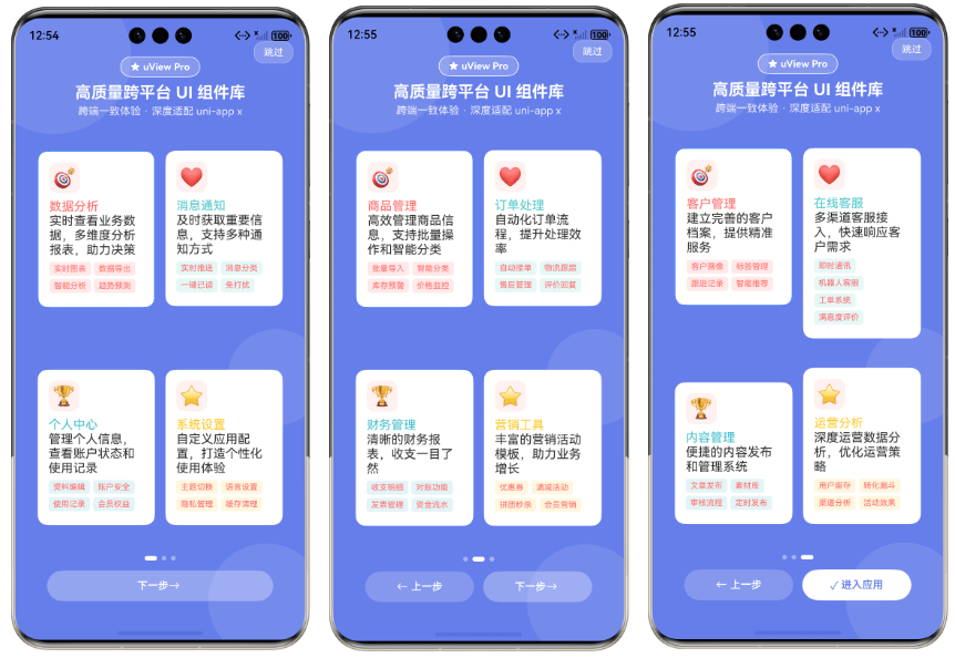
自定义样式
组件提供了丰富的 slot,可以完全自定义引导页的各个部分:
html
<template>
    <ux-guide-page v-model:show="showGuide" :slides="slides">
        <!-- 自定义背景 -->
        <template #background>
            <view class="custom-bg">
                <view class="gradient-circle"></view>
            </view>
        </template>

        <!-- 自定义跳过按钮 -->
        <template #skip="{ onSkip }">
            <view class="skip-btn" @click="onSkip">
                <text>跳过</text>
            </view>
        </template>

        <!-- 自定义头部 -->
        <template #header="{ current, total }">
            <view class="custom-header">
                <text>步骤 {{ current + 1 }} / {{ total }}</text>
            </view>
        </template>

        <!-- 自定义页面内容 -->
        <template #slide="{ slide, index, isActive }">
            <view v-if="isActive" class="custom-slide">
                <text class="title">{{ slide.cards[0].title }}</text>
                <text class="desc">{{ slide.cards[0].desc }}</text>
            </view>
        </template>

        <!-- 自定义指示器 -->
        <template #dots="{ current, total }">
            <view class="custom-dots">
                <view
                    v-for="i in total"
                    :key="i"
                    :class="['dot', { active: i - 1 === current }]"
                ></view>
            </view>
        </template>

        <!-- 自定义操作按钮 -->
        <template #actions="{ isFirst, isLast, onPrev, onNext, onComplete }">
            <view class="custom-actions">
                <button v-if="!isFirst" @click="onPrev">上一步</button>
                <button v-if="!isLast" @click="onNext">下一步</button>
                <button v-if="isLast" @click="onComplete">开始使用</button>
            </view>
        </template>
    </ux-guide-page>
</template>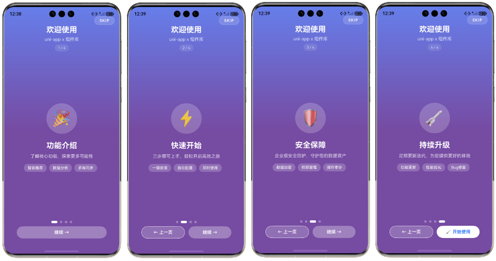
双向绑定(v-model:show)
组件支持 v-model:show 双向绑定,可以更方便地控制引导页的显示状态。
html
<template>
    <ux-guide-page v-model:show="showGuide" :slides="slides"></ux-guide-page>
    <button @click="showGuide = true">重新显示引导</button>
</template>

<script setup lang="ts">
import { ref } from 'vue'

const showGuide = ref(false)
const slides = ref([...])
</script>
控制显示元素
通过 props 可以控制引导页各部分的显示与隐藏:
html
<template>
    <!-- 隐藏跳过按钮和指示器 -->
    <ux-guide-page
        v-model:show="showGuide"
        :slides="slides"
        :show-skip="false"
        :show-dots="false"
    ></ux-guide-page>

    <!-- 隐藏头部和操作按钮 -->
    <ux-guide-page
        v-model:show="showGuide"
        :slides="slides"
        :show-header="false"
        :show-actions="false"
    ></ux-guide-page>
</template>
监听事件
组件提供了丰富的事件回调:
html
<template>
    <ux-guide-page
        v-model:show="showGuide"
        :slides="slides"
        @change="onChange"
        @complete="onComplete"
        @skip="onSkip"
    ></ux-guide-page>
</template>

<script setup lang="ts">
import { ref } from 'vue'

const showGuide = ref(true)
const slides = ref([...])

function onChange(index: number) {
    console.log('切换到第', index + 1, '页')
}

function onComplete() {
    console.log('引导完成')
    // 引导完成后跳转到首页
    uni.switchTab({ url: '/pages/index/index' })
}

function onSkip() {
    console.log('用户跳过了引导')
    // 跳过引导也跳转到首页
    uni.switchTab({ url: '/pages/index/index' })
}
</script>
禁用滑动切换
如果不希望用户通过滑动切换页面,可以禁用滑动功能:
html
<ux-guide-page
    v-model:show="showGuide"
    :slides="slides"
    :enable-swipe="false"
></ux-guide-page>
手动控制页面跳转
可以通过 ref 获取组件实例,手动控制页面跳转:
html
<template>
    <ux-guide-page ref="guideRef" v-model:show="showGuide" :slides="slides"></ux-guide-page>
    <button @click="goToPage(2)">跳转到第3页</button>
</template>

<script setup lang="ts">
import { ref } from 'vue'

const showGuide = ref(true)
const slides = ref([...])
const guideRef = ref()

function goToPage(index: number) {
    guideRef.value?.goToSlide(index)
}
</script>
平台适配注意事项
App 端 linear-gradient 限制
App 端 linear-gradient 需要三个色值才能生效:
scss
/* ✅ 正确 */
.custom-bg {
    background: linear-gradient(180deg, #667eea 0%, #764ba2 50%, #764ba2 100%);
}

/* ❌ 错误 - 两个色值在 App 端不生效 */
.custom-bg {
    background: linear-gradient(180deg, #667eea 0%, #764ba2 100%);
}
App 端动画实现
App 端不支持 @keyframes,请使用 transition:
scss
/* ✅ 正确 - 使用 transition */
.card {
    opacity: 0;
    transform: translateY(30rpx);
    transition: all 0.4s ease;
}

.card-visible {
    opacity: 1;
    transform: translateY(0);
}

/* ❌ 错误 - App 端不支持 */
@keyframes fadeIn {
    from { opacity: 0; }
    to { opacity: 1; }
}
API
Props
| 参数 | 说明 | 类型 | 默认值 | 可选值 | 版本 |
|---|---|---|---|---|---|
| show | 是否显示引导页(支持 v-model:show) | Boolean | false | true/false | - |
| storageKey | 本地存储键名,用于记录用户是否已查看引导 | String | - | - | - |
| slides | 引导页数据数组 | Array | [] | - | - |
| enableSwipe | 是否允许滑动切换页面 | Boolean | true | true/false | - |
| showDots | 是否显示页面指示器 | Boolean | true | true/false | - |
| showSkip | 是否显示跳过按钮 | Boolean | true | true/false | - |
| showHeader | 是否显示头部区域 | Boolean | true | true/false | - |
| showActions | 是否显示底部操作按钮 | Boolean | true | true/false | - |
Slides 数据结构
typescript
type OnboardingCard = {
    icon: string;              // 卡片图标(可以是 emoji 或图片 URL)
    title: string;             // 卡片标题
    desc: string;              // 卡片描述
    position: 'top-left' | 'top-right' | 'center' | 'bottom-left' | 'bottom-right';
    features?: string[];       // 特性列表(可选)
    delay?: number;            // 动画延迟时间(毫秒,可选)
}

type OnboardingSlide = {
    cards: OnboardingCard[];   // 该页面的卡片数组
}
Methods
| 名称 | 说明 | 参数 | 版本 |
|---|---|---|---|
| goToSlide | 跳转到指定页面 | (index: number) | - |
| handleNext | 切换到下一页 | - | - |
| handlePrev | 切换到上一页 | - | - |
| handleComplete | 完成引导 | - | - |
Slots
| 名称 | 说明 | 作用域参数 | 版本 |
|---|---|---|---|
| background | 自定义背景 | - | - |
| skip | 自定义跳过按钮 | - | |
| header | 自定义头部 | - | |
| slide | 自定义页面内容 | - | |
| card-icon | 自定义卡片图标 | - | |
| card-content | 自定义卡片内容 | - | |
| dots | 自定义页面指示器 | - | |
| actions | 自定义操作按钮 | - |
Events
| 事件名 | 说明 | 回调参数 | 版本 |
|---|---|---|---|
| change | 页面切换时触发 | (index: number) | - |
| complete | 点击完成按钮时触发 | - | - |
| skip | 点击跳过按钮时触发 | - | - |
| update:show | v-model:show 双向绑定事件 | (show: boolean) | - |
完整示例代码
html
<template>
<view class="demo-container">
<!-- 全屏引导页 - 示例1: 使用默认样式 -->
<ux-guide-page
v-if="exampleType == 'default'"
v-model:show="guideVisible"
enable-swipe
:storage-key="STORAGE_KEY"
:slides="customSlides"
@complete="onGuideComplete"
@skip="onGuideSkip"
/>
<!-- 全屏引导页 - 示例2: 使用 slot 自定义卡片卡片图标和内容 -->
<ux-guide-page
v-else-if="exampleType == 'custom-card'"
v-model:show="guideVisible"
:storage-key="STORAGE_KEY"
:slides="customSlides"
enable-swipe
@complete="onGuideComplete"
@skip="onGuideSkip"
>
<!-- 自定义卡片图标 -->
<template #card-icon="{ cIndex }">
<view class="custom-card-icon">
<text class="custom-card-icon-emoji">
{{ cIndex == 0 ? '🎯' : cIndex == 1 ? '❤️' : cIndex == 2 ? '🏆' : '⭐' }}
</text>
</view>
</template>
<!-- 自定义卡片内容 -->
<template #card-content="{ index, cIndex }">
<view class="custom-card-content">
<text class="custom-card-title" :style="{ color: getCardColor(cIndex as number) }">
{{ customSlides[index as number].cards[cIndex as number].title }}
</text>
<text class="custom-card-desc">
{{ customSlides[index as number].cards[cIndex as number].desc }}
</text>
<view v-if="customSlides[index as number].cards[cIndex as number].features" class="custom-card-tags">
<text
v-for="(feature, fIndex) in customSlides[index as number].cards[cIndex as number].features"
:key="fIndex"
class="custom-card-tag"
:style="{ backgroundColor: getTagColor(cIndex as number) }"
>
{{ feature }}
</text>
</view>
</view>
</template>
</ux-guide-page>
<!-- 全屏引导页 - 示例3: 使用 slot 自定义页面内容 -->
<ux-guide-page
v-else-if="exampleType == 'custom-slide'"
v-model:show="guideVisible"
:storage-key="STORAGE_KEY"
:slides="simpleSlides"
enable-swipe
:show-skip="false"
:show-header="false"
:show-actions="false"
@complete="onGuideComplete"
@skip="onGuideSkip"
>
<!-- 自定义背景 -->
<template #background>
<view class="custom-bg">
<view class="custom-bg-gradient"></view>
</view>
</template>
<!-- 自定义跳过按钮 -->
<template #skip="{ onSkip }">
<view class="custom-skip" @click="onSkip">
<text class="custom-skip-text">SKIP</text>
</view>
</template>
<!-- 自定义头部 -->
<template #header="{ current, total }">
<view class="custom-header">
<text class="custom-header-title">欢迎使用</text>
<text class="custom-header-subtitle">uni-app x 组件库</text>
<text class="custom-header-progress">{{ (current as number) + 1 }} / {{ total }}</text>
</view>
</template>
<!-- 自定义页面内容 -->
<template #slide="{ index, isActive }">
<view class="custom-slide" v-if="isActive">
<view class="custom-slide-icon">
<text class="custom-slide-icon-text">{{ simpleSlides[index as number].cards[0].icon }}</text>
</view>
<text class="custom-slide-title">{{ simpleSlides[index as number].cards[0].title }}</text>
<text class="custom-slide-desc">{{ simpleSlides[index as number].cards[0].desc }}</text>
<view class="custom-slide-features">
<text
v-for="(feature, fIndex) in simpleSlides[index as number].cards[0].features"
:key="fIndex"
class="custom-slide-feature"
>
{{ feature }}
</text>
</view>
</view>
</template>
<!-- 自定义指示器 -->
<template #dots="{ current, total }">
<view class="custom-dots">
<view
v-for="(item, idx) in (total as number)"
:key="idx"
class="custom-dot"
:class="{ 'custom-dot--active': idx == (current as number) }"
></view>
</view>
</template>
<!-- 自定义操作按钮 -->
<template #actions="{ isFirst, isLast, onPrev, onNext, onComplete }">
<view class="custom-actions">
<view v-if="isFirst == false" class="custom-btn custom-btn--prev" @click="onPrev">
<text class="custom-btn-text">← 上一页</text>
</view>
<view v-if="isLast == false" class="custom-btn custom-btn--next" @click="onNext">
<text class="custom-btn-text">继续 →</text>
</view>
<view v-if="isLast == true" class="custom-btn custom-btn--complete" @click="onComplete">
<text class="custom-btn-text">🚀 开始使用</text>
</view>
</view>
</template>
</ux-guide-page>
<!-- 全屏引导页 - 示例4: 使用 Props 控制显示 -->
<ux-guide-page
v-else-if="exampleType == 'props-control'"
v-model:show="guideVisible"
:storage-key="STORAGE_KEY"
:slides="customSlides"
enable-swipe
:show-dots="false"
:show-skip="false"
@complete="onGuideComplete"
@skip="onGuideSkip"
/>
<!-- 全屏引导页 - 示例5: 完全自定义(使用所有 slot + props 控制显示) -->
<ux-guide-page
v-else-if="exampleType == 'full-custom'"
v-model:show="guideVisible"
:storage-key="STORAGE_KEY"
:slides="simpleSlides"
enable-swipe
:show-dots="false"
:show-skip="false"
:show-header="false"
@complete="onGuideComplete"
@skip="onGuideSkip"
>
<!-- 自定义背景 -->
<template #background>
<view class="full-custom-bg">
<view class="full-custom-bg-shape shape-1"></view>
<view class="full-custom-bg-shape shape-2"></view>
<view class="full-custom-bg-shape shape-3"></view>
</view>
</template>
<!-- 自定义跳过 -->
<template #skip="{ onSkip }">
<view class="full-custom-skip" @click="onSkip">
<text class="full-custom-skip-icon">✕</text>
</view>
</template>
<!-- 自定义头部 -->
<template #header="{ current, total }">
<view class="full-custom-header">
<view class="full-custom-logo">
<text class="full-custom-logo-icon">🎨</text>
</view>
<text class="full-custom-header-title">UX Guide</text>
<view class="full-custom-steps">
<view
v-for="(item, idx) in (total as number)"
:key="idx"
class="full-custom-step"
:class="{ 'full-custom-step--active': idx <= (current as number) }"
>
<text class="full-custom-step-num">{{ idx + 1 }}</text>
</view>
</view>
</view>
</template>
<!-- 自定义页面内容 -->
<template #slide="{ index, isActive }">
<view class="full-custom-slide" v-if="isActive">
<view class="full-custom-card">
<view class="full-custom-card-icon">
<text class="full-custom-card-icon-text">{{ simpleSlides[index as number].cards[0].icon }}</text>
</view>
<text class="full-custom-card-title">{{ simpleSlides[index as number].cards[0].title }}</text>
<text class="full-custom-card-desc">{{ simpleSlides[index as number].cards[0].desc }}</text>
<view class="full-custom-card-features">
<view
v-for="(feature, fIndex) in simpleSlides[index as number].cards[0].features"
:key="fIndex"
class="full-custom-card-feature"
>
<view class="full-custom-card-feature-check">
<text class="full-custom-card-feature-check-text">✓</text>
</view>
<text class="full-custom-card-feature-text">{{ feature }}</text>
</view>
</view>
</view>
</view>
</template>
<!-- 自定义操作按钮 -->
<template #actions="{ isFirst, isLast, onPrev, onNext, onComplete }">
<view class="full-custom-actions">
<view
class="full-custom-btn"
:class="{ 'full-custom-btn--disabled': isFirst == true }"
@click="onPrev"
>
<text class="full-custom-btn-text">上一页</text>
</view>
<view
v-if="isLast == false"
class="full-custom-btn full-custom-btn--primary full-custom-btn--margin-left"
@click="onNext"
>
<text class="full-custom-btn-text">下一页</text>
</view>
<view
v-if="isLast == true"
class="full-custom-btn full-custom-btn--success full-custom-btn--margin-left"
@click="onComplete"
>
<text class="full-custom-btn-text">完成</text>
</view>
</view>
</template>
</ux-guide-page>
<!-- 单卡片展示 - Emoji 图标 -->
<ux-guide-page
v-else-if="exampleType == 'single-emoji'"
v-model:show="guideVisible"
:storage-key="STORAGE_KEY"
:slides="singleCardEmojiSlides"
enable-swipe
@complete="onGuideComplete"
@skip="onGuideSkip"
/>
<!-- 单卡片展示 - 图片图标 -->
<ux-guide-page
v-else-if="exampleType == 'single-image'"
v-model:show="guideVisible"
:storage-key="STORAGE_KEY"
:slides="singleCardImageSlides"
enable-swipe
@complete="onGuideComplete"
@skip="onGuideSkip"
/>
<!-- 控制面板 -->
<view v-if="guideVisible == false" class="control-panel">
<text class="control-title">全屏引导页展示示例</text>
<view class="control-buttons">
<view
class="control-btn"
:class="{ 'control-btn--active': exampleType == 'default' }"
@click="switchExample('default')"
>
<text
class="control-btn-text"
:class="{ 'control-btn-text--active': exampleType == 'default' }"
>
多卡片样式
</text>
</view>
<view
class="control-btn"
:class="{ 'control-btn--active': exampleType == 'custom-card' }"
@click="switchExample('custom-card')"
>
<text
class="control-btn-text"
:class="{ 'control-btn-text--active': exampleType == 'custom-card' }"
>
自定义卡片
</text>
</view>
<view
class="control-btn"
:class="{ 'control-btn--active': exampleType == 'custom-slide' }"
@click="switchExample('custom-slide')"
>
<text
class="control-btn-text"
:class="{ 'control-btn-text--active': exampleType == 'custom-slide' }"
>
自定义页面
</text>
</view>
<view
class="control-btn"
:class="{ 'control-btn--active': exampleType == 'full-custom' }"
@click="switchExample('full-custom')"
>
<text
class="control-btn-text"
:class="{ 'control-btn-text--active': exampleType == 'full-custom' }"
>
完全自定义
</text>
</view>
<view
class="control-btn"
:class="{ 'control-btn--active': exampleType == 'props-control' }"
@click="switchExample('props-control')"
>
<text
class="control-btn-text"
:class="{ 'control-btn-text--active': exampleType == 'props-control' }"
>
Props控制
</text>
</view>
<view
class="control-btn"
:class="{ 'control-btn--active': exampleType == 'single-emoji' }"
@click="switchExample('single-emoji')"
>
<text
class="control-btn-text"
:class="{ 'control-btn-text--active': exampleType == 'single-emoji' }"
>
单卡片-Emoji
</text>
</view>
<view
class="control-btn"
:class="{ 'control-btn--active': exampleType == 'single-image' }"
@click="switchExample('single-image')"
>
<text
class="control-btn-text"
:class="{ 'control-btn-text--active': exampleType == 'single-image' }"
>
单卡片-图片
</text>
</view>
</view>
<view class="demo-replay-btn" @click="showGuide">
<text class="demo-replay-text">重新播放引导</text>
</view>
</view>
</view>
</template>
<script setup lang="uts">
import type { OnboardingSlide } from '@/uni_modules/ux-guide-page/types';
const STORAGE_KEY = 'ux_guide_demo_onboarding_viewed';
const guideVisible = ref<boolean>(true);
const exampleType = ref<string>('default');
const switchExample = (type: string) => {
exampleType.value = type;
};
// 根据卡片索引获取颜色
const getCardColor = (index: number): string => {
const colors = ['#ff6b6b', '#4ecdc4', '#45b7d1', '#f9ca24'];
return colors[index % colors.length];
};
// 根据卡片索引获取标签背景色
const getTagColor = (index: number): string => {
const colors = ['rgba(255, 107, 107, 0.15)', 'rgba(78, 205, 196, 0.15)', 'rgba(69, 183, 209, 0.15)', 'rgba(249, 202, 36, 0.15)'];
return colors[index % colors.length];
};
// 用于完全自定义示例的简单 slides(每个 slide 只有一张卡片)
const simpleSlides: OnboardingSlide[] = [
{
cards: [
{
icon: '🎉',
title: '功能介绍',
desc: '了解核心功能,探索更多可能性',
position: 'center',
size: 'medium',
features: ['智能推荐', '数据分析', '多端同步']
}
]
},
{
cards: [
{
icon: '⚡',
title: '快速开始',
desc: '三步即可上手,轻松开启高效之旅',
position: 'center',
size: 'medium',
features: ['一键安装', '自动配置', '即时使用']
}
]
},
{
cards: [
{
icon: '🛡️',
title: '安全保障',
desc: '企业级安全防护,守护您的数据资产',
position: 'center',
size: 'medium',
features: ['数据加密', '权限管理', '操作审计']
}
]
},
{
cards: [
{
icon: '🚀',
title: '持续升级',
desc: '定期更新迭代,为您提供更好的体验',
position: 'center',
size: 'medium',
features: ['功能更新', '性能优化', 'Bug修复']
}
]
}
];
const customSlides: OnboardingSlide[] = [
{
cards: [
{
icon: '📊',
title: '数据分析',
desc: '实时查看业务数据,多维度分析报表,助力决策',
position: 'top-left',
size: 'medium',
features: ['实时图表', '数据导出', '智能分析', '趋势预测']
},
{
icon: '🔔',
title: '消息通知',
desc: '及时获取重要信息,支持多种通知方式',
position: 'top-right',
size: 'medium',
delay: 100,
features: ['实时推送', '消息分类', '一键已读', '免打扰']
},
{
icon: '👤',
title: '个人中心',
desc: '管理个人信息,查看账户状态和使用记录',
position: 'bottom-left',
size: 'medium',
delay: 200,
features: ['资料编辑', '账户安全', '使用记录', '会员权益']
},
{
icon: '⚙️',
title: '系统设置',
desc: '自定义应用配置,打造个性化使用体验',
position: 'bottom-right',
size: 'medium',
delay: 300,
features: ['主题切换', '语言设置', '隐私管理', '缓存清理']
}
]
},
{
cards: [
{
icon: '🛍️',
title: '商品管理',
desc: '高效管理商品信息,支持批量操作和智能分类',
position: 'top-left',
size: 'medium',
features: ['批量导入', '智能分类', '库存预警', '价格监控']
},
{
icon: '📦',
title: '订单处理',
desc: '自动化订单流程,提升处理效率',
position: 'top-right',
size: 'medium',
delay: 100,
features: ['自动接单', '物流跟踪', '售后管理', '评价回复']
},
{
icon: '💰',
title: '财务管理',
desc: '清晰的财务报表,收支一目了然',
position: 'bottom-left',
size: 'medium',
delay: 200,
features: ['收支明细', '对账功能', '发票管理', '资金流水']
},
{
icon: '📈',
title: '营销工具',
desc: '丰富的营销活动模板,助力业务增长',
position: 'bottom-right',
size: 'medium',
delay: 300,
features: ['优惠券', '满减活动', '拼团秒杀', '会员营销']
}
]
},
{
cards: [
{
icon: '🤝',
title: '客户管理',
desc: '建立完善的客户档案,提供精准服务',
position: 'top-left',
size: 'medium',
features: ['客户画像', '标签管理', '跟进记录', '智能推荐']
},
{
icon: '💬',
title: '在线客服',
desc: '多渠道客服接入,快速响应客户需求',
position: 'top-right',
size: 'medium',
delay: 100,
features: ['即时通讯', '机器人客服', '工单系统', '满意度评价']
},
{
icon: '📋',
title: '内容管理',
desc: '便捷的内容发布和管理系统',
position: 'bottom-left',
size: 'medium',
delay: 200,
features: ['文章发布', '素材库', '审核流程', '定时发布']
},
{
icon: '🎯',
title: '运营分析',
desc: '深度运营数据分析,优化运营策略',
position: 'bottom-right',
size: 'medium',
delay: 300,
features: ['用户留存', '转化漏斗', '渠道分析', '活动效果']
}
]
}
]
// 单卡片展示 - Emoji 图标示例
const singleCardEmojiSlides: OnboardingSlide[] = [
{
cards: [
{
icon: '🛍️',
title: '海量商品',
desc: '精选百万优质商品,满足你的各种需求',
position: 'center',
features: ['品质保证', '七天无理由', '极速发货']
}
]
},
{
cards: [
{
icon: '💰',
title: '优惠多多',
desc: '新人专享大礼包,首单立减 50 元',
position: 'center',
features: ['新人礼包', '每日签到', '积分抵现']
}
]
},
{
cards: [
{
icon: '🚚',
title: '极速配送',
desc: '全国 300+ 城市次日达',
position: 'center',
features: ['次日达', '实时追踪', '送货上门']
}
]
}
];
// 单卡片展示 - 图片图标示例
const singleCardImageSlides: OnboardingSlide[] = [
{
cards: [
{
icon: 'https://img.icons8.com/color/96/shopping-bag.png',
title: '购物商城',
desc: '海量商品等你选购,品质保证',
position: 'center',
features: ['正品保障', '极速发货', '售后无忧']
}
]
},
{
cards: [
{
icon: 'https://img.icons8.com/color/96/discount.png',
title: '优惠中心',
desc: '领券购物更省钱,每日上新',
position: 'center',
features: ['大额优惠券', '限时秒杀', '会员专享']
}
]
},
{
cards: [
{
icon: 'https://img.icons8.com/color/96/delivery.png',
title: '极速物流',
desc: '全国配送,实时追踪物流信息',
position: 'center',
features: ['次日达', '全程追踪', '送货上门']
}
]
}
];
const showGuide = () => {
guideVisible.value = true;
};
const onGuideComplete = () => {
uni.showToast({
title: '引导完成',
icon: 'success'
});
};
const onGuideSkip = () => {
uni.showToast({
title: '已跳过',
icon: 'none'
});
};
</script>
<style lang="scss">
.demo-container {
flex: 1;
position: relative;
}
.control-panel {
position: absolute;
top: 50%;
left: 50%;
transform: translate(-50%, -50%);
width: 600rpx;
display: flex;
flex-direction: column;
align-items: center;
}
.control-title {
font-size: 32rpx;
font-weight: 600;
color: #303133;
margin-bottom: 32rpx;
}
.control-buttons {
width: 100%;
display: flex;
flex-direction: column;
}
.control-btn + .control-btn {
margin-top: 24rpx;
}
.control-btn {
height: 88rpx;
border-radius: 44rpx;
background-color: #f5f5f5;
display: flex;
align-items: center;
justify-content: center;
}
.control-btn--active {
background-color: #2979ff;
}
.control-btn-text {
font-size: 28rpx;
color: #606266;
}
.control-btn-text--active {
color: #ffffff;
}
.demo-replay-btn {
margin-top: 48rpx;
display: flex;
flex-direction: row;
align-items: center;
padding: 24rpx 48rpx;
background: linear-gradient(135deg, #2979ff, #1957b1);
border-radius: 44rpx;
}
.demo-replay-text {
margin-left: 12rpx;
color: #fff;
font-size: 28rpx;
font-weight: 600;
}
.custom-header {
display: flex;
flex-direction: column;
align-items: center;
padding: 40rpx 0;
}
.custom-header-title {
font-size: 48rpx;
font-weight: 700;
color: #ffffff;
}
.custom-header-subtitle {
font-size: 28rpx;
color: rgba(255, 255, 255, 0.8);
margin-top: 16rpx;
}
.custom-slide {
flex: 1;
display: flex;
flex-direction: column;
align-items: center;
justify-content: center;
padding: 40rpx;
}
.custom-slide-icon {
width: 200rpx;
height: 200rpx;
border-radius: 100rpx;
background-color: rgba(255, 255, 255, 0.2);
display: flex;
align-items: center;
justify-content: center;
margin-bottom: 48rpx;
}
.custom-slide-icon-text {
font-size: 100rpx;
}
.custom-slide-title {
font-size: 48rpx;
font-weight: 700;
color: #ffffff;
margin-bottom: 24rpx;
}
.custom-slide-desc {
font-size: 28rpx;
color: rgba(255, 255, 255, 0.8);
text-align: center;
margin-bottom: 32rpx;
}
.custom-slide-features {
display: flex;
flex-direction: row;
}
.custom-slide-feature {
padding: 12rpx 24rpx;
border-radius: 24rpx;
background-color: rgba(255, 255, 255, 0.2);
color: #ffffff;
font-size: 24rpx;
margin-right: 16rpx;
}
.custom-slide-feature:last-child {
margin-right: 0;
}
.custom-dots {
display: flex;
flex-direction: row;
justify-content: center;
align-items: center;
margin: 20rpx 0;
}
.custom-dots-text {
font-size: 28rpx;
color: rgba(255, 255, 255, 0.8);
}
.custom-actions {
display: flex;
flex-direction: row;
justify-content: center;
width: 100%;
padding: 0 40rpx 40rpx;
}
.custom-btn {
flex: 1;
height: 80rpx;
border-radius: 40rpx;
display: flex;
align-items: center;
justify-content: center;
margin: 0 12rpx;
}
.custom-btn--prev {
background-color: rgba(255, 255, 255, 0.2);
border: 2rpx solid #ffffff;
}
.custom-btn--next {
background-color: rgba(255, 255, 255, 0.3);
}
.custom-btn--complete {
background-color: #ffffff;
}
.custom-btn-text {
font-size: 28rpx;
font-weight: 600;
color: #ffffff;
}
.custom-btn--complete .custom-btn-text {
color: #2979ff;
}
.custom-card-icon {
width: 80rpx;
height: 80rpx;
border-radius: 20rpx;
background-color: rgba(255, 107, 107, 0.1);
display: flex;
align-items: center;
justify-content: center;
margin-bottom: 16rpx;
}
.custom-card-icon-emoji {
font-size: 48rpx;
}
.custom-card-content {
display: flex;
flex-direction: column;
}
.custom-card-tags {
display: flex;
flex-direction: row;
flex-wrap: wrap;
margin-top: 12rpx;
}
.custom-card-tag {
padding: 6rpx 12rpx;
border-radius: 8rpx;
background-color: rgba(255, 107, 107, 0.1);
color: #ff6b6b;
font-size: 20rpx;
margin-right: 8rpx;
margin-bottom: 8rpx;
}
/* 自定义背景样式 */
.custom-bg {
position: absolute;
top: 0;
left: 0;
right: 0;
bottom: 0;
background: linear-gradient(180deg, #667eea 0%, #764ba2 50%, #764ba2 100%);
overflow: hidden;
}
.custom-bg-gradient {
position: absolute;
top: 0;
left: 0;
right: 0;
bottom: 0;
background: linear-gradient(180deg, #667eea 0%, #764ba2 50%, #764ba2 100%);
}
/* 自定义跳过按钮 */
.custom-skip {
position: absolute;
top: 60rpx;
/* #ifdef MP */
left: 30rpx;
/* #endif */
/* #ifndef MP */
right: 30rpx;
/* #endif */
z-index: 10;
padding: 12rpx 32rpx;
border-radius: 30rpx;
background-color: rgba(255, 255, 255, 0.15);
border: 2rpx solid rgba(255, 255, 255, 0.3);
}
.custom-skip-text {
font-size: 24rpx;
color: #ffffff;
font-weight: 600;
letter-spacing: 2rpx;
}
/* 自定义头部进度 */
.custom-header-progress {
font-size: 24rpx;
color: rgba(255, 255, 255, 0.7);
margin-top: 16rpx;
padding: 8rpx 20rpx;
border-radius: 20rpx;
background-color: rgba(255, 255, 255, 0.1);
}
/* 自定义指示器 */
.custom-dot {
width: 16rpx;
height: 16rpx;
border-radius: 8rpx;
background-color: rgba(255, 255, 255, 0.3);
margin: 0 8rpx;
transition: all 0.3s ease;
}
.custom-dot--active {
width: 40rpx;
background-color: #ffffff;
}
/* ========== 完全自定义样式 ========== */
.full-custom-bg {
position: absolute;
top: 0;
left: 0;
right: 0;
bottom: 0;
background: linear-gradient(180deg, #1a1a2e 0%, #16213e 50%, #0f3460 100%);
overflow: hidden;
}
.full-custom-bg-shape {
position: absolute;
border-radius: 50%;
}
.full-custom-bg-shape.shape-1 {
width: 400rpx;
height: 400rpx;
background: rgba(233, 69, 96, 0.3);
top: -100rpx;
right: -100rpx;
}
.full-custom-bg-shape.shape-2 {
width: 300rpx;
height: 300rpx;
background: rgba(77, 171, 247, 0.3);
bottom: 20%;
left: -80rpx;
}
.full-custom-bg-shape.shape-3 {
width: 250rpx;
height: 250rpx;
background: rgba(255, 206, 86, 0.2);
bottom: -50rpx;
right: 20%;
}
.full-custom-skip {
position: absolute;
top: 60rpx;
/* #ifdef MP */
left: 30rpx;
/* #endif */
/* #ifndef MP */
right: 30rpx;
/* #endif */
z-index: 10;
width: 60rpx;
height: 60rpx;
border-radius: 30rpx;
background-color: rgba(255, 255, 255, 0.1);
display: flex;
align-items: center;
justify-content: center;
}
.full-custom-skip-icon {
font-size: 28rpx;
color: #ffffff;
}
.full-custom-header {
display: flex;
flex-direction: column;
align-items: center;
padding: 60rpx 40rpx 40rpx;
}
.full-custom-logo {
width: 100rpx;
height: 100rpx;
border-radius: 50rpx;
background: linear-gradient(135deg, #e94560, #ff6b6b);
display: flex;
align-items: center;
justify-content: center;
margin-bottom: 20rpx;
box-shadow: 0 8rpx 32rpx rgba(233, 69, 96, 0.3);
}
.full-custom-logo-icon {
font-size: 48rpx;
}
.full-custom-header-title {
font-size: 40rpx;
font-weight: 700;
color: #ffffff;
margin-bottom: 32rpx;
}
.full-custom-steps {
display: flex;
flex-direction: row;
align-items: center;
}
.full-custom-step {
width: 48rpx;
height: 48rpx;
border-radius: 24rpx;
background-color: rgba(255, 255, 255, 0.1);
display: flex;
align-items: center;
justify-content: center;
margin: 0 12rpx;
border: 2rpx solid rgba(255, 255, 255, 0.2);
}
.full-custom-step--active {
background: linear-gradient(135deg, #e94560, #ff6b6b);
border-color: transparent;
}
.full-custom-step-num {
font-size: 24rpx;
color: #ffffff;
font-weight: 600;
}
.full-custom-slide {
width: 100%;
flex: 1;
display: flex;
align-items: center;
justify-content: center;
padding: 40rpx;
}
.full-custom-card {
width: 100%;
display: flex;
flex-direction: column;
align-items: center;
background-color: rgba(255, 255, 255, 0.05);
border-radius: 32rpx;
padding: 48rpx;
border: 2rpx solid rgba(255, 255, 255, 0.1);
}
.full-custom-card-icon {
width: 120rpx;
height: 120rpx;
border-radius: 60rpx;
background: linear-gradient(135deg, rgba(233, 69, 96, 0.2), rgba(255, 107, 107, 0.2));
display: flex;
align-items: center;
justify-content: center;
margin-bottom: 32rpx;
}
.full-custom-card-icon-text {
font-size: 60rpx;
}
.full-custom-card-title {
font-size: 40rpx;
font-weight: 700;
color: #ffffff;
margin-bottom: 16rpx;
}
.full-custom-card-desc {
font-size: 28rpx;
color: rgba(255, 255, 255, 0.7);
margin-bottom: 32rpx;
line-height: 1.6;
}
.full-custom-card-features {
display: flex;
flex-direction: column;
}
.full-custom-card-feature {
display: flex;
flex-direction: row;
align-items: center;
margin-bottom: 16rpx;
}
.full-custom-card-feature:last-child {
margin-bottom: 0;
}
.full-custom-card-feature-check {
width: 32rpx;
height: 32rpx;
border-radius: 16rpx;
background: linear-gradient(135deg, #e94560, #ff6b6b);
display: flex;
align-items: center;
justify-content: center;
margin-right: 16rpx;
}
.full-custom-card-feature-check-text {
font-size: 20rpx;
color: #ffffff;
}
.full-custom-card-feature-text {
font-size: 26rpx;
color: rgba(255, 255, 255, 0.8);
}
.full-custom-actions {
display: flex;
flex-direction: row;
justify-content: center;
align-items: center;
padding: 0 40rpx 60rpx;
}
.full-custom-btn--margin-left {
margin-left: 24rpx;
}
.full-custom-btn {
flex: 1;
height: 88rpx;
border-radius: 44rpx;
background-color: rgba(255, 255, 255, 0.1);
border: 2rpx solid rgba(255, 255, 255, 0.2);
display: flex;
align-items: center;
justify-content: center;
}
.full-custom-btn--disabled {
opacity: 0.3;
}
.full-custom-btn--primary {
background: linear-gradient(135deg, #e94560, #ff6b6b);
border-color: transparent;
}
.full-custom-btn--success {
background: linear-gradient(135deg, #4ade80, #22c55e);
border-color: transparent;
}
.full-custom-btn-text {
font-size: 28rpx;
font-weight: 600;
color: #ffffff;
}
</style>